UX / UI
Branding
The Gallery of Modern Art + Urban Design (MAUD) stands as a testament to the evolution of artistic expression in the contemporary world. Situated in the heart of the Toronto, MAUD serves as a dynamic platform that showcases cutting-edge artworks from diverse genres and mediums. This mobile application is dedicated to bringing a smooth and seamless experience for the gallery’s customers. Users will be able to view upcoming events and purchase tickets and products.
Potential customers that work full-time jobs or live at a distance from the gallery struggle to visit the gallery during operational hours.
Design an app for the gallery that allows users to view the exhibited artists, view upcoming events to plan their visits, and shop the gallery’s store online.
I conducted interviews, created empathy maps, and used my synthesized data to identify common themes that will inform my design decisions. The main problem is that users are too busy to visit the gallery during operational hours. Other issues included language accessibility and viewing exhibited art online so the user doesn’t have to compromise their busy schedule.
Section 1
28
Boyfriend
Canada & Belgium
Student & Architect
Louise is a 28-year-old architect that moved to Toronto, Canada from Brussels, Belgium, with her boyfriend while pursuing her masters in architecture. She works full-time and is taking night classes. Her love for visiting museums is on hold due to her busy schedule. She’d like to visit and explore them online.
Louise Peeters is a busy full-time architect and student who needs a way to view art galleries and their stores online because her busy schedule doesn’t permit her time to experience art galleries in person.
Wants to visit galleries online and purchase art, prints, and apparel online.
Doesn’t have time to visit galleries due to work and studies and can’t try on the clothes prior to purchasing.
20
Single
Canada & Kenya
Student & Part-time
Zawadi moved to Toronto from Kenya when he was 19. He’s enrolled in an online school to learn English while working at a clothing store part-time. He and his family love art and culture and visiting art galleries. He prefers viewing galleries online but many don’t have a Swahili translation.
Zawadi Wambui is a 20-year-old immigrant student from Kenya who needs art galleries to offer in app translations from English to Swahili because he wants to learn about the art and culture prior to visiting an art gallery.
Wants to view galleries and their stores online prior to visiting with his family. Wants his family to experience local art and culture.
Struggles with language barriers and finding galleries with affordable souvenirs.
Section 2
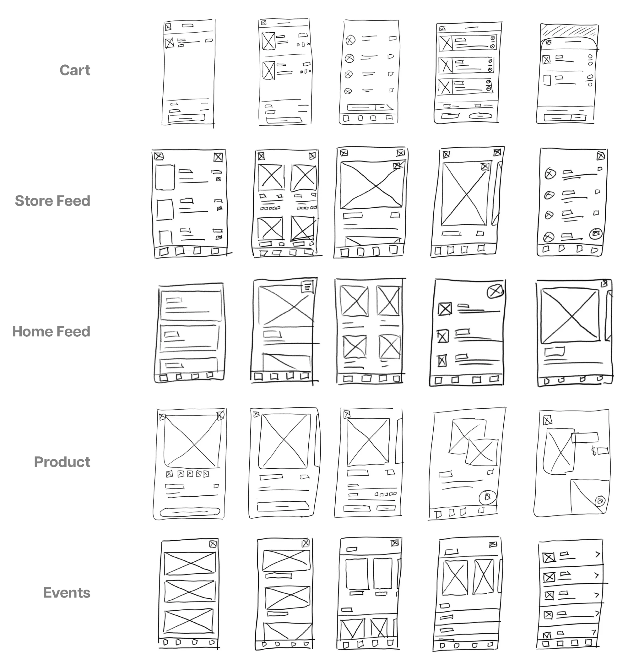
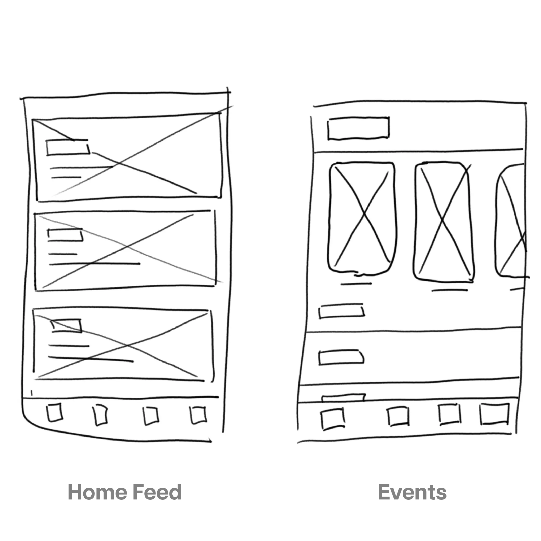
Simple and quick, I started the process with paper wireframes. They’re a great way quickly iterate initial ideas. I brainstormed variations of some of the main screens, like the home page, store, and events page. These paper wireframes set a foundation for low fidelity designs.
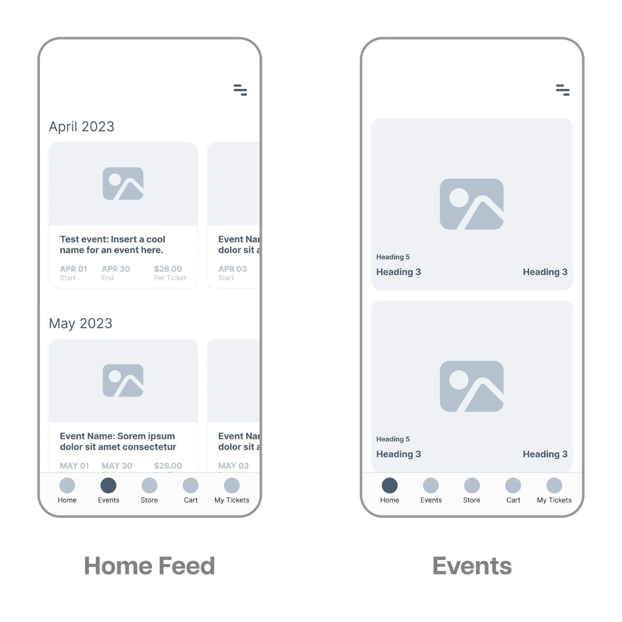
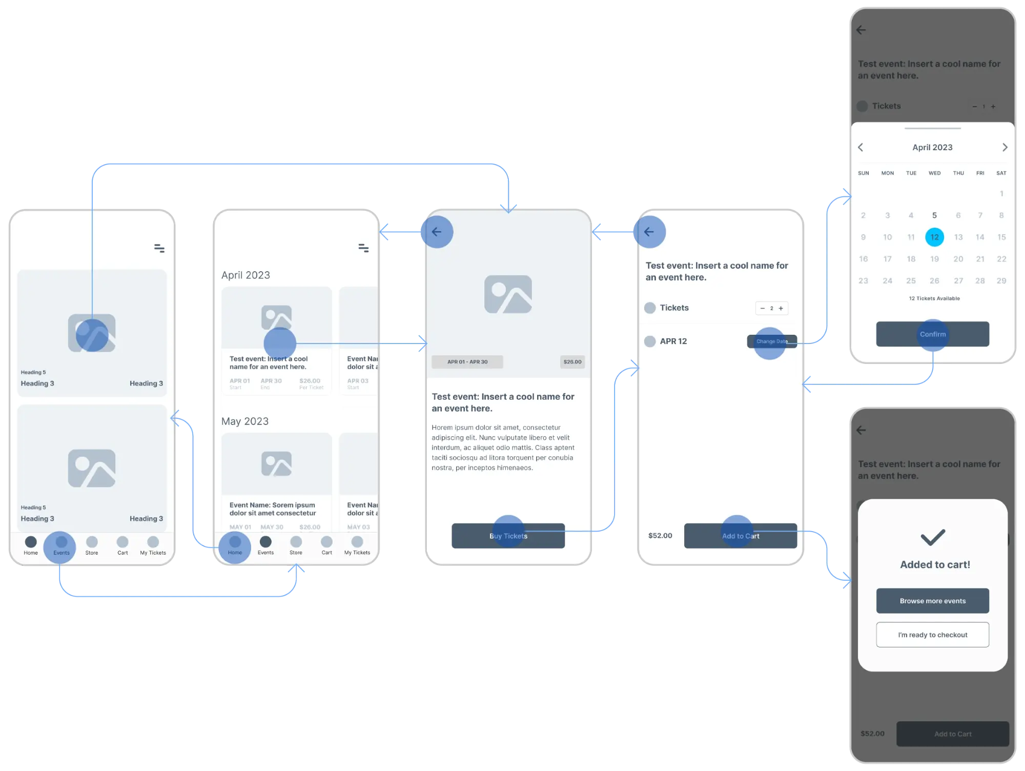
The next step was to turn my paper wireframes into low fidelity digital wireframes. This is where we introduced grids and organization to create appealing, but low detail, wireframes. Once created, we added interactions to the wireframes to create a basic prototype.
This was the first of two usability studies that I performed. This study helped guide me from paper wireframe to a low fidelity prototype.
4 of 5 participants seamlessly used the key functions of the app.
A participant wanted to add more than one tote bag to the cart - this function needs to be built out in the next iteration.
A participant struggled with the smallest font size. This needs to be reviewed in the next iteration.
Several participants wanted to change their method of payment to something other than credit / debit. Methods like PayPal, Apple Pay, etc., need to be included.
Section 3
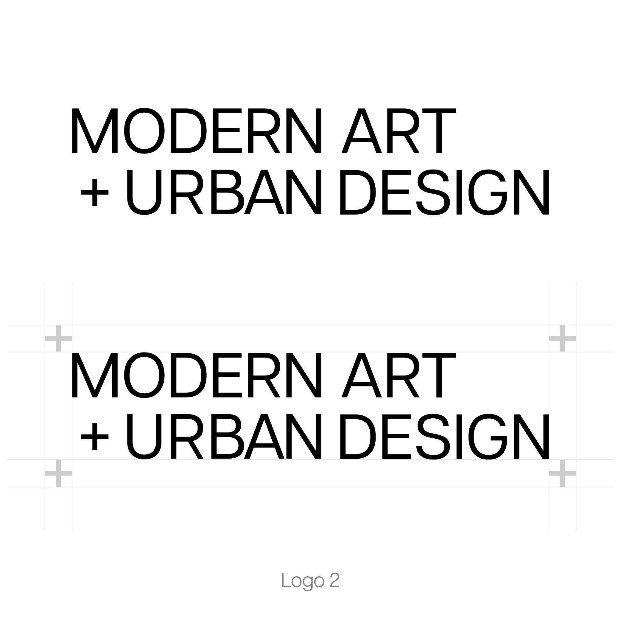
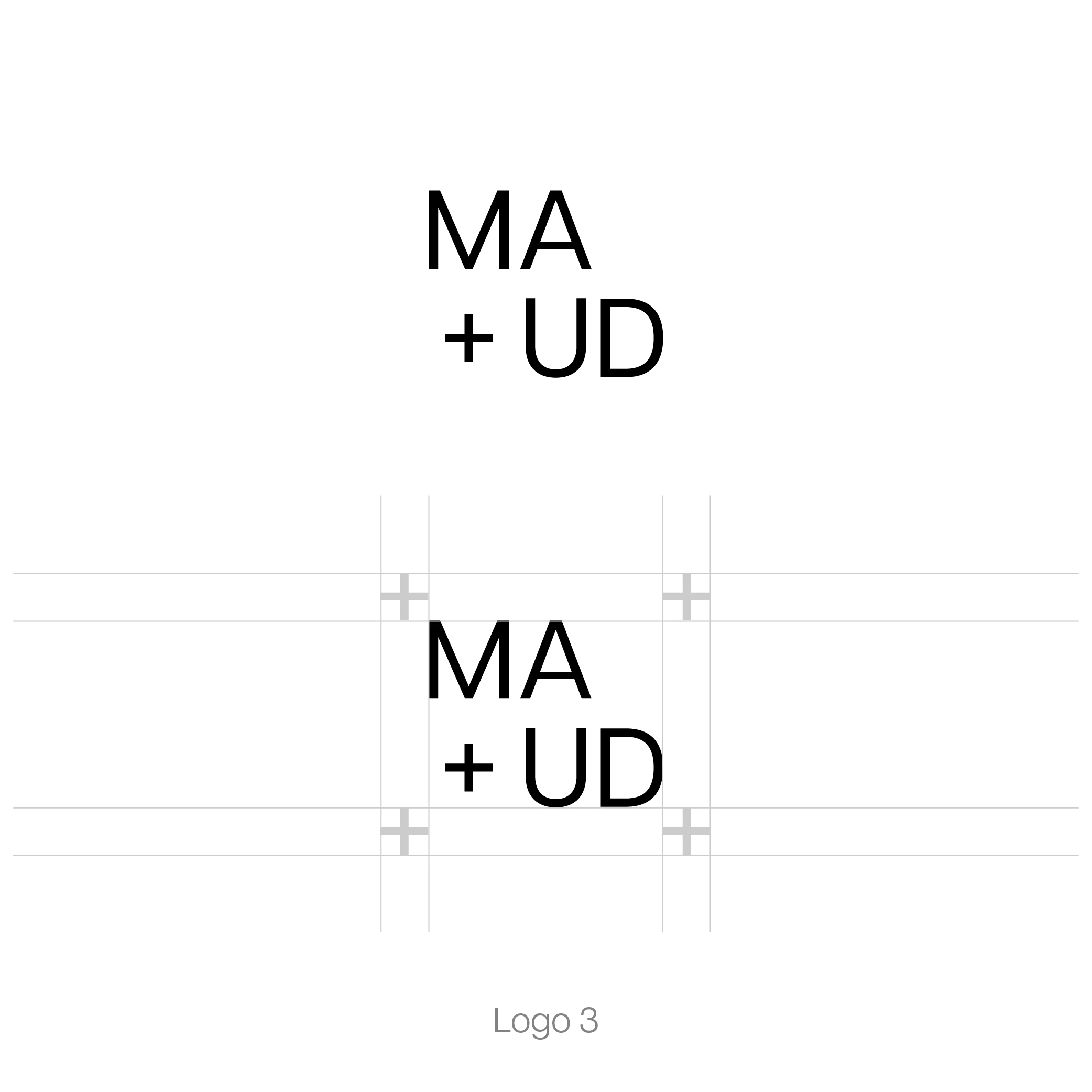
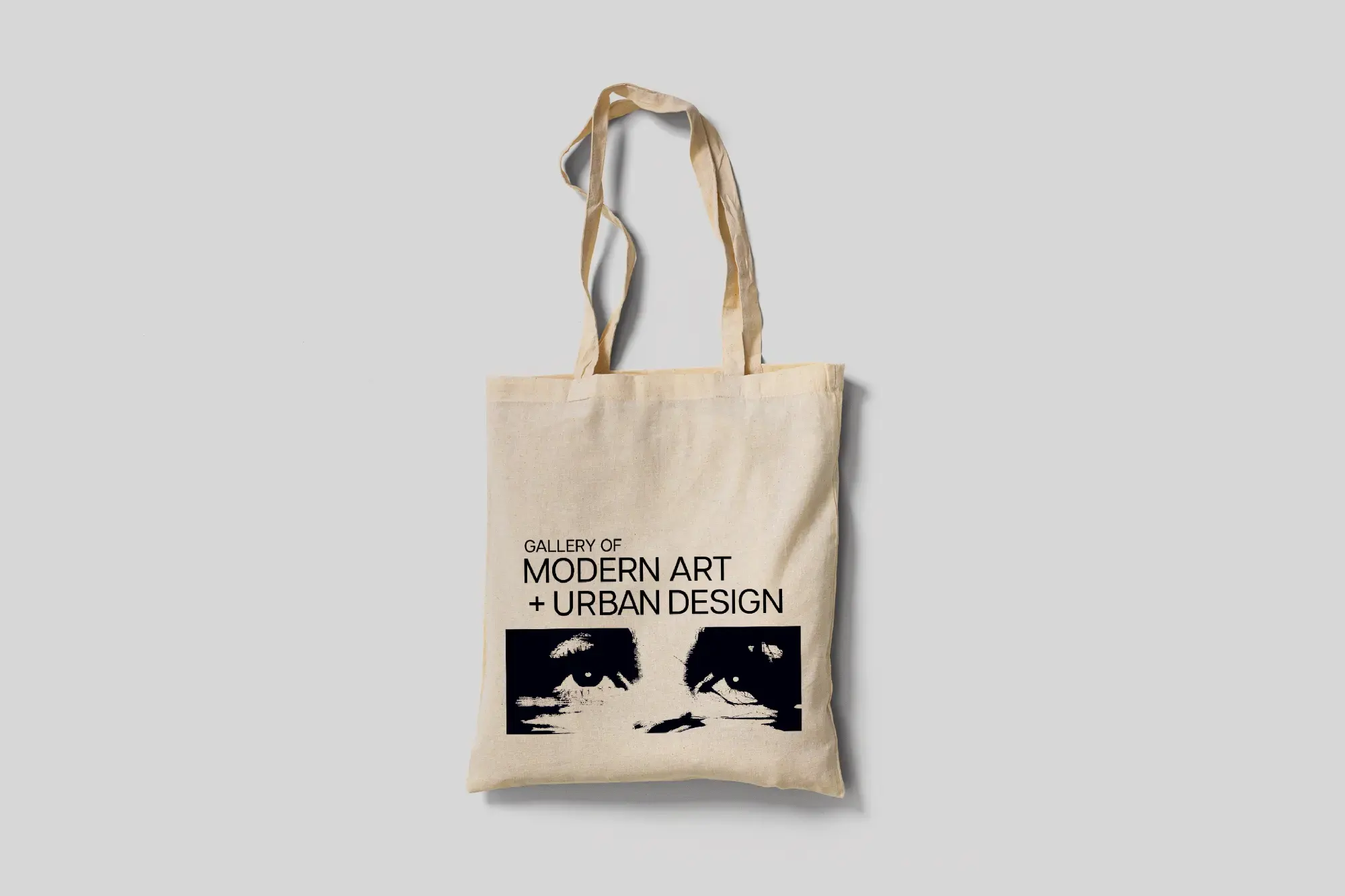
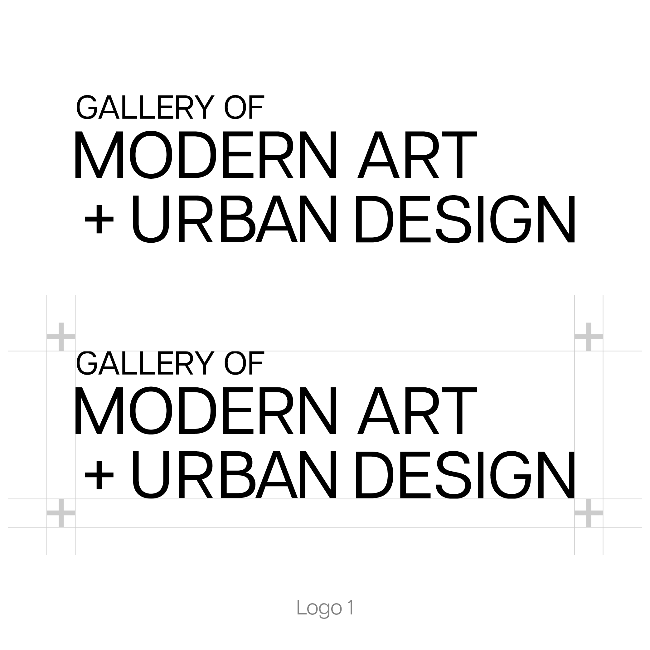
A timeless logotype leveraging a sans-serif typeface. The three logo iterations ensure the logo is scalable and versatile for any use. Logo 3 is perfect for smaller uses, like icons and avatars, while logo 1 and 2 are great for larger cases, like print and banners.
Using the condensed logo variation, the MAUD logo is placed on a black background. This is perfect for Apple’s or Android’s app icon and for any social media profile.
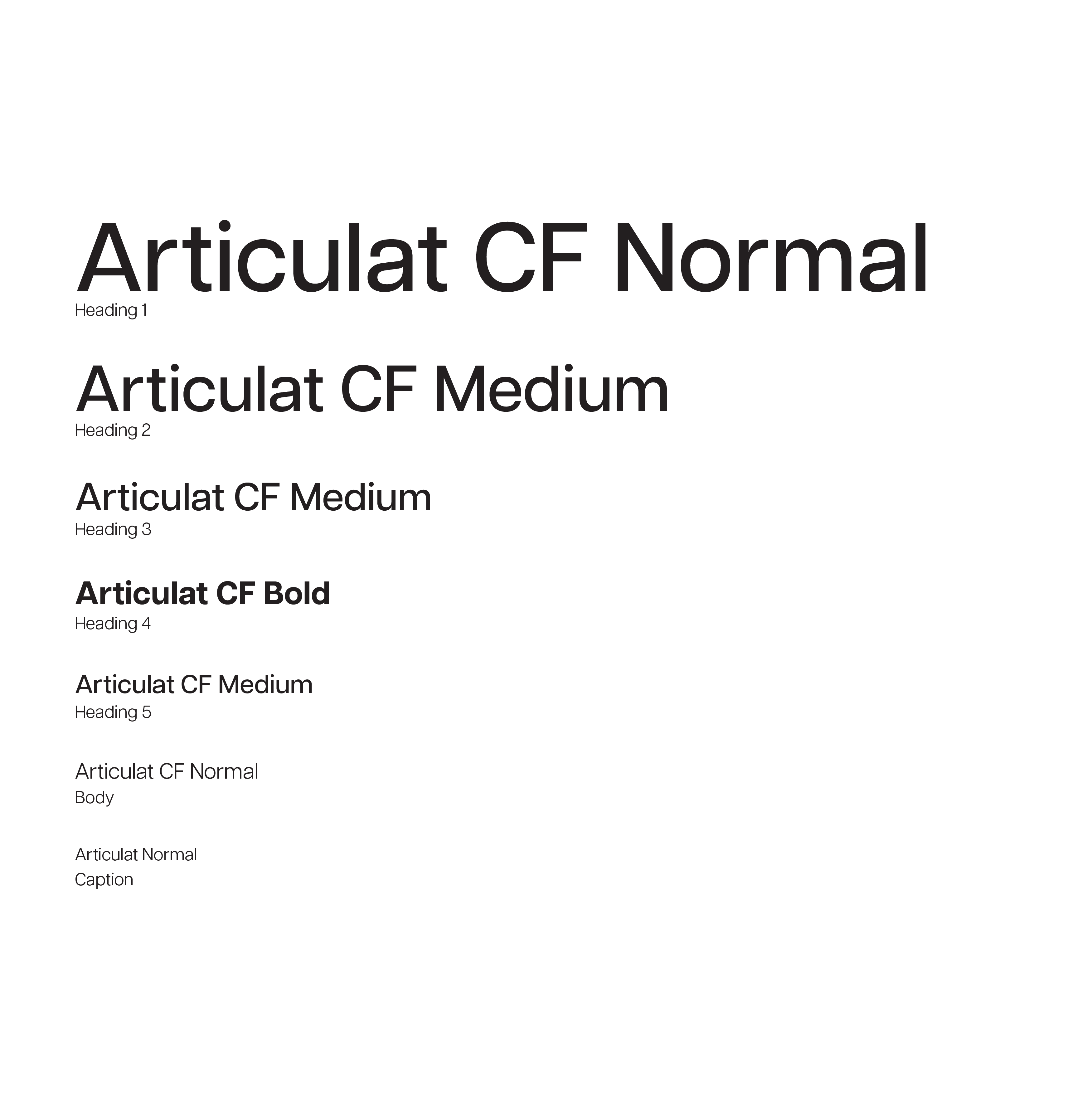
Articulat is a great typeface with a variety of fonts to choose from. It can be bold or it can be subtle - ranging from thin to heavy. It’s great for legibility, print, and web uses.
The primary colour palette uses black, white, and three shades of grey. This provides a sense of simplicity and ensures the branding isn’t competing with artwork for the clients’ attention. The primary palette is supported with a colour system that spans the entire colour wheel. When it comes to visuals or web components that aren’t paired with artwork, it makes for a tasteful pop of colour.
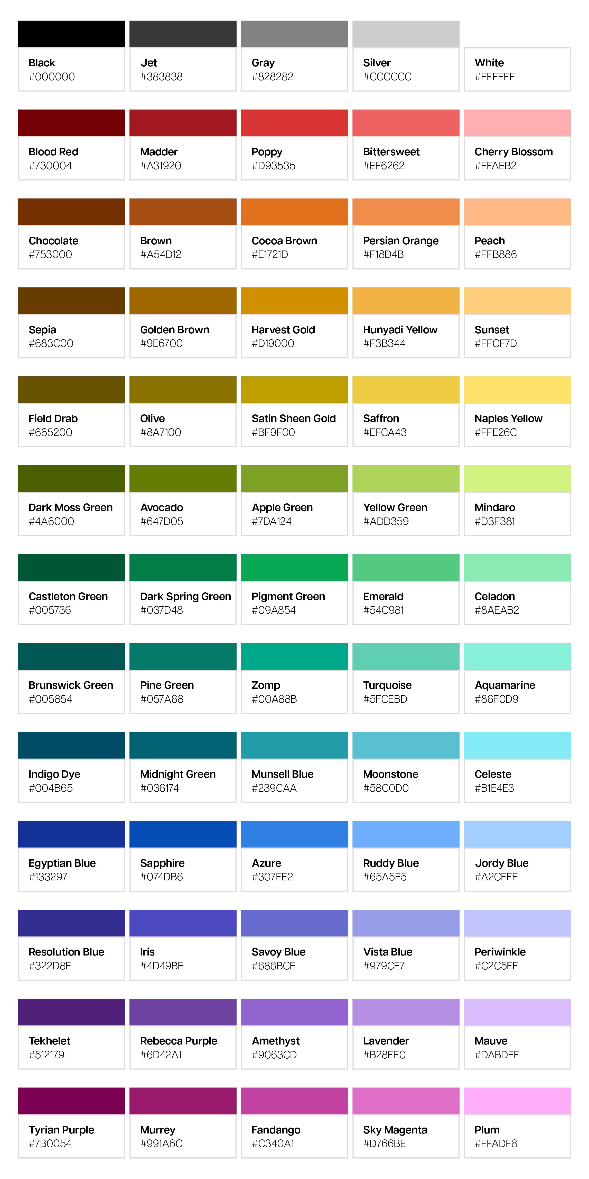
#730004
#A31920
#D93535
#EF6262
#FFAEB2
#753000
#A54D12
#E1721D
#F18D4B
#FFB886
#683C00
#9E6700
#D19000
#F3B344
#FFCF7D
#665200
#8A7100
#BF9F00
#EFCA43
#FFE26C
#4A6000
#647D05
#7DA124
#ADD359
#D3F381
#005736
#037D48
#09A854
#54C981
#8AEAB2
#005854
#057A68
#00A88B
#5FCEBD
#86F0D9
#004B65
#036174
#239CAA
#58C0D0
#B1E4E3
#133297
#074DB6
#307FE2
#65A5F5
#A2CFFF
#322D8E
#4D49BE
#686BCE
#979CE7
#C2C5FF
#512179
#6D42A1
#9063CD
#B28FE0
#DABDFF
#7B0054
#991A6C
#C340A1
#D766BE
#FFADF8
Section 4
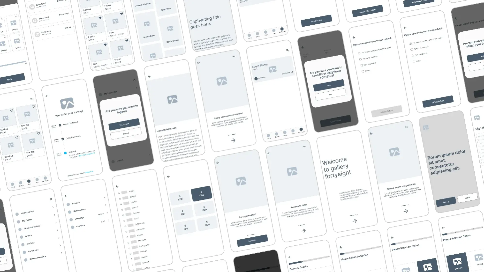
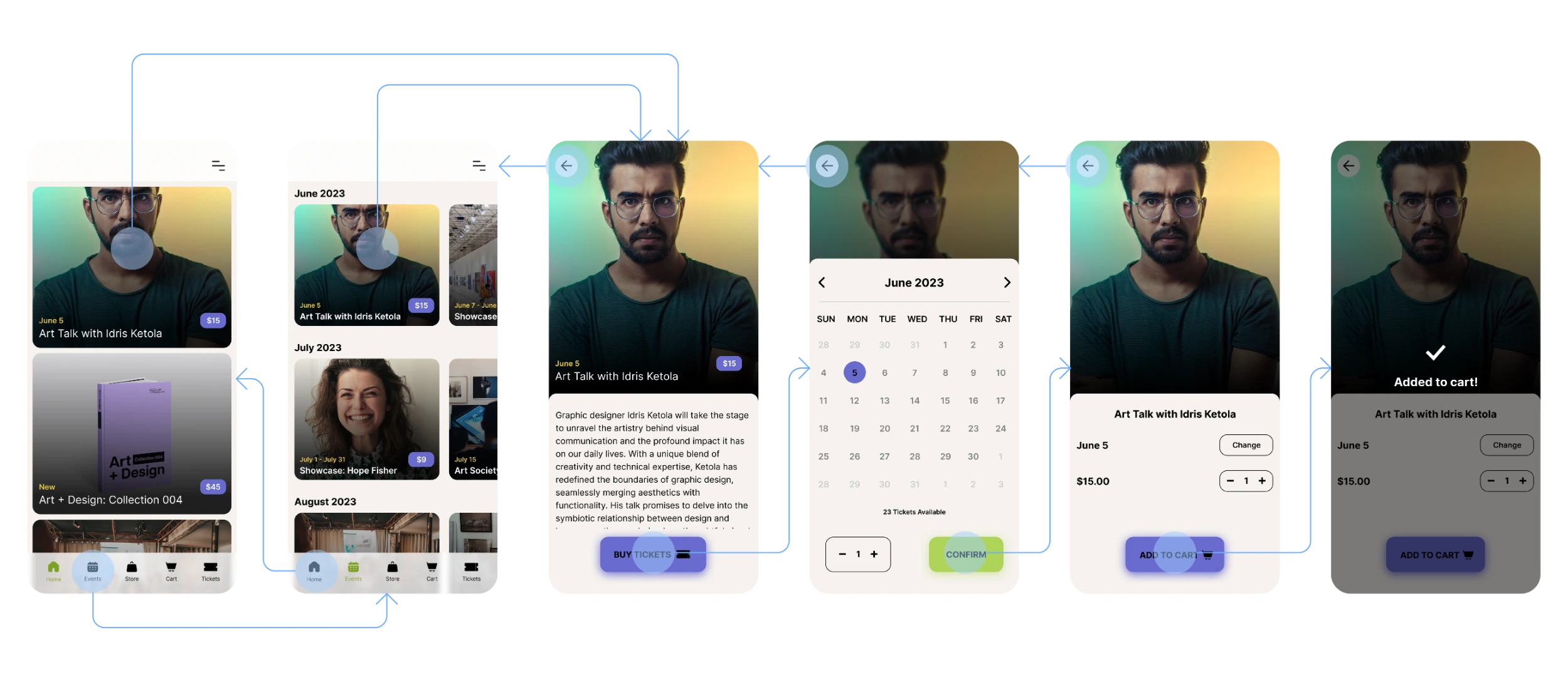
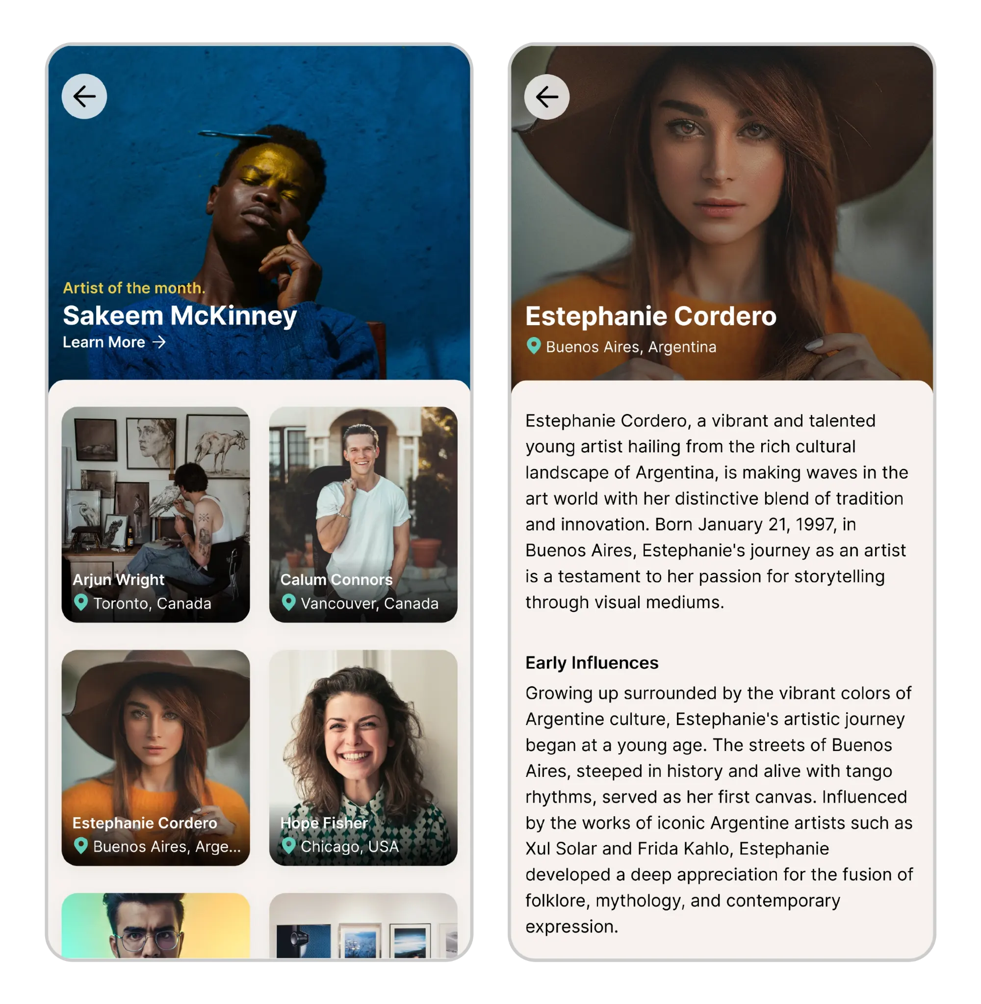
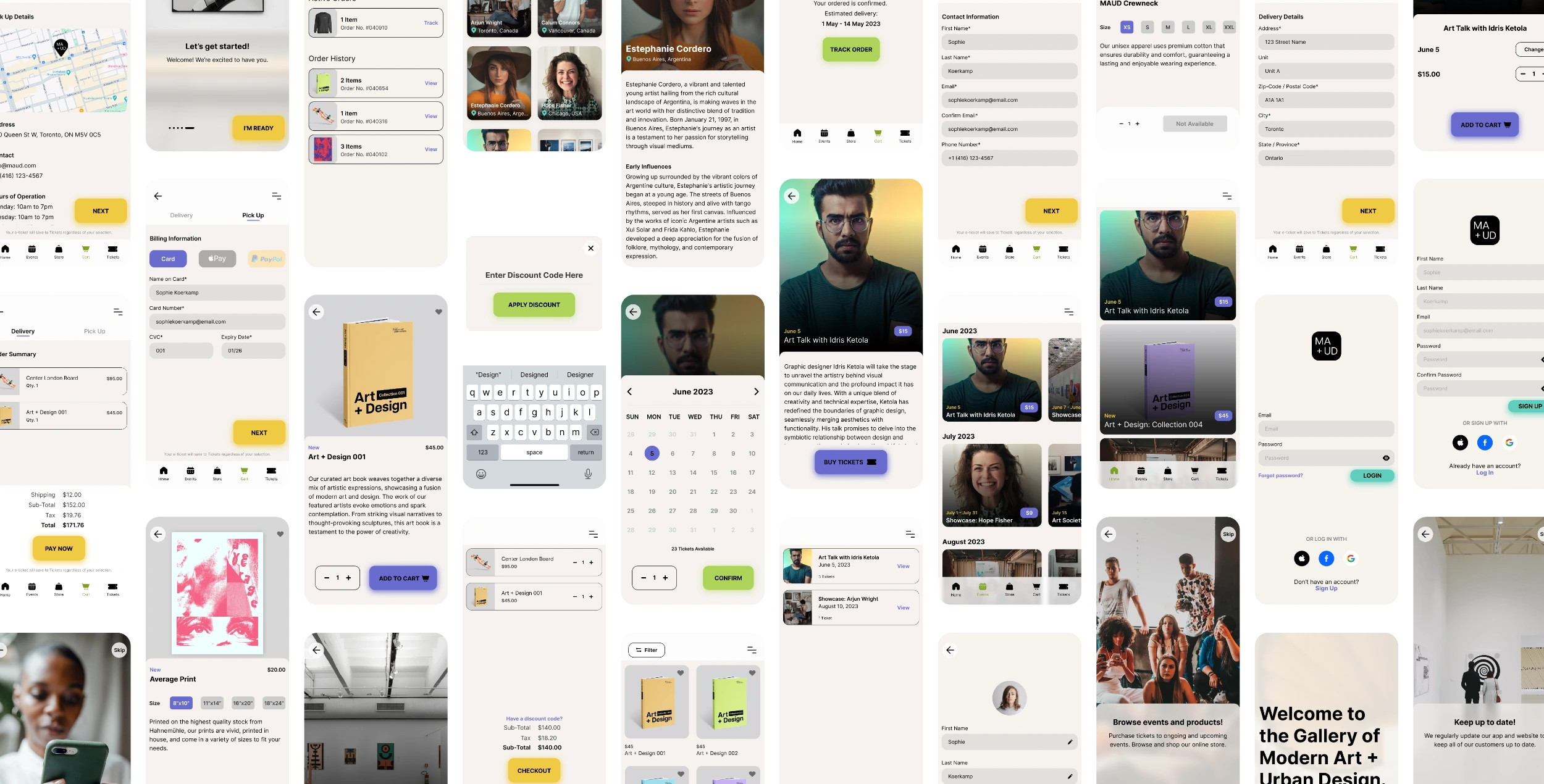
From paper wireframes to low fidelity digital wireframes and onto high fidelity prototypes. The frames on the right show how the home feed was developed from initial idea on paper to the final look and feel. In this section, I’ll showcase a sample of the prototype as well as all of the high fidelity frames that make up the final prototype.
Contrast ratio for colour.
Alternative text for imagery.
Use of icons to help with navigation.
Multiple language options.
This was the second and of two usability studies that I performed. This study helped guide me from low fidelity prototype to a high fidelity protype and the following findings will help me iterate for a future usability study.
Option to change accent colour to personalize experience (instead of plum, can choose from the colour system).
Option for a light mode, again to personalize a user’s experience. Some users prefer a white background over black.
Ability to view the artist’s work when you click on their profile as well as links to their social media and portfolio.