Discovery
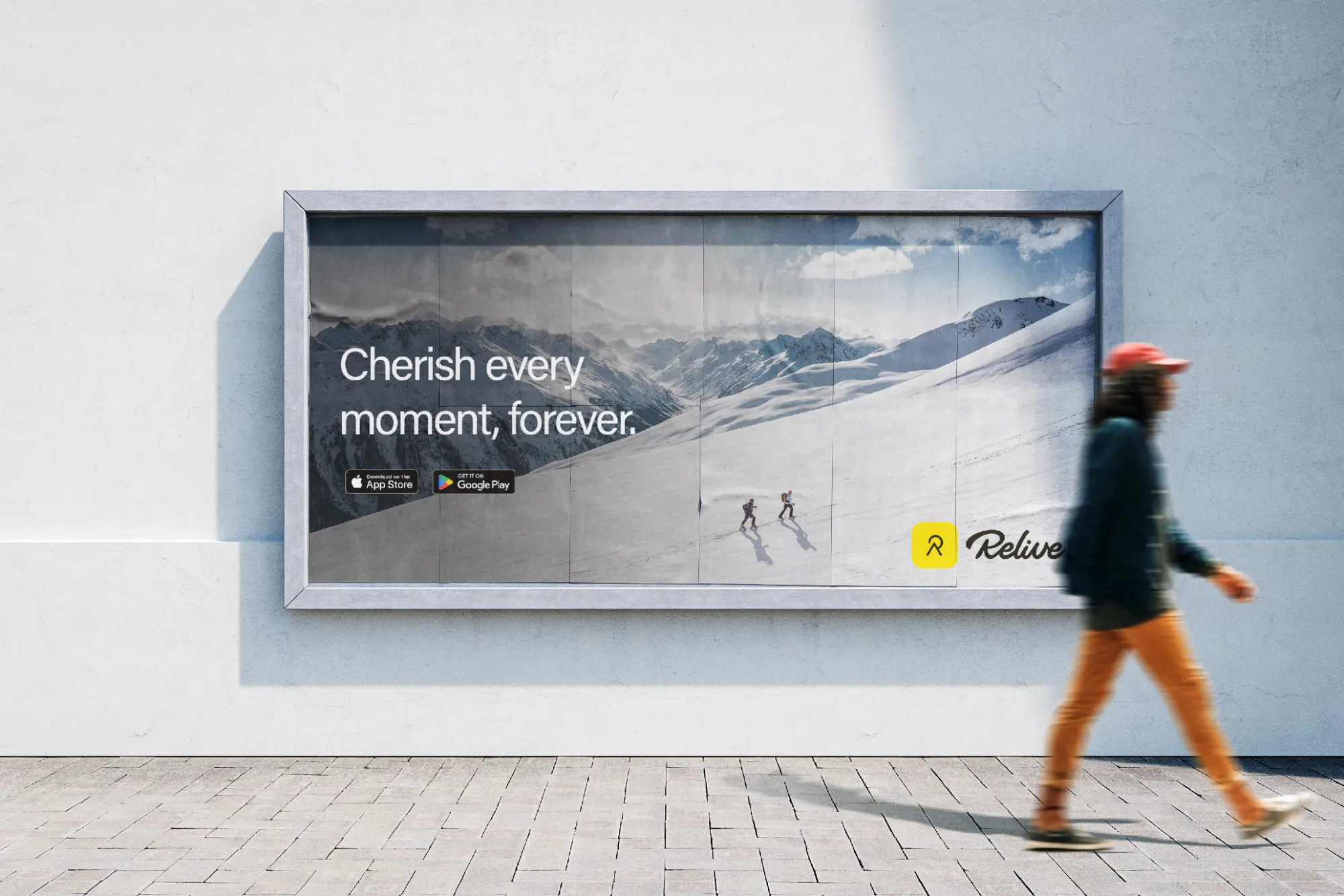
Relive is an app designed to automatically log a variety of activities such as walking, running, cycling, hiking, and road tripping. Essentially, creating a digital time capsule that can be revisited and shared with friends and an online community. Our goal was to attract and convert new users from other platforms, improve the function and design of the app, and emphasize our product's unique selling proposition: vehicular activity tracking.
UX / UI Design
Design Audit

"I have to keep switching between Google Maps and Relive to check my route."
Danny, 34

"I only record three activities and I don't like having to scroll through all the activities every time I switch."
Marlon, 27

"Not sure why I would switch from Strava to Relive. All my friends are already on Strava."
Jessica, 29

"I wish this app had a notification page. I keep missing when I get a new follower or comment."
Amanda, 22

"I keep losing my friends when I ride with them. I need to pull over and call them every time."
Steven, 42
With the testimonials received, we're able to put together a few quick questions to learn a little more about what the users want. Once we collect this information, we can summarize the user needs and finalize a direction for our UI design.
of users don't see a reason to switch from other platforms, like Strava.
of users would benefit from in-app trip planning.
want group tracking for activities.
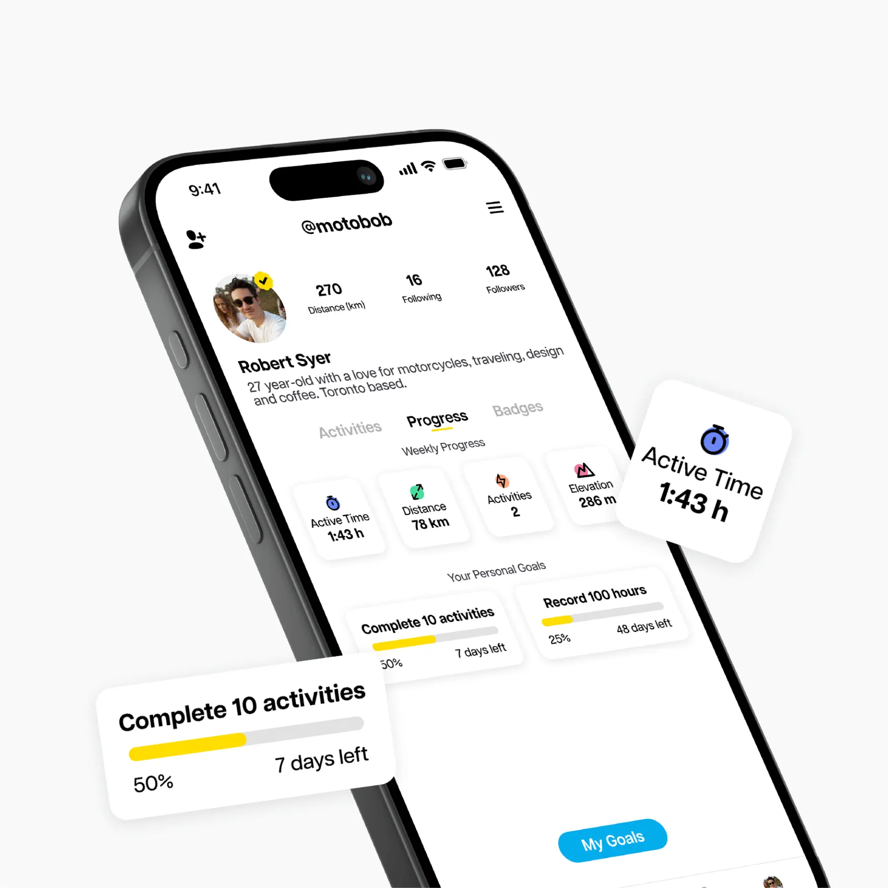
We use fictional user personas as characters that represent the findings and testimonials from interviewees and users. This allows us to consolidate a group of problems and experiences into a couple of users.
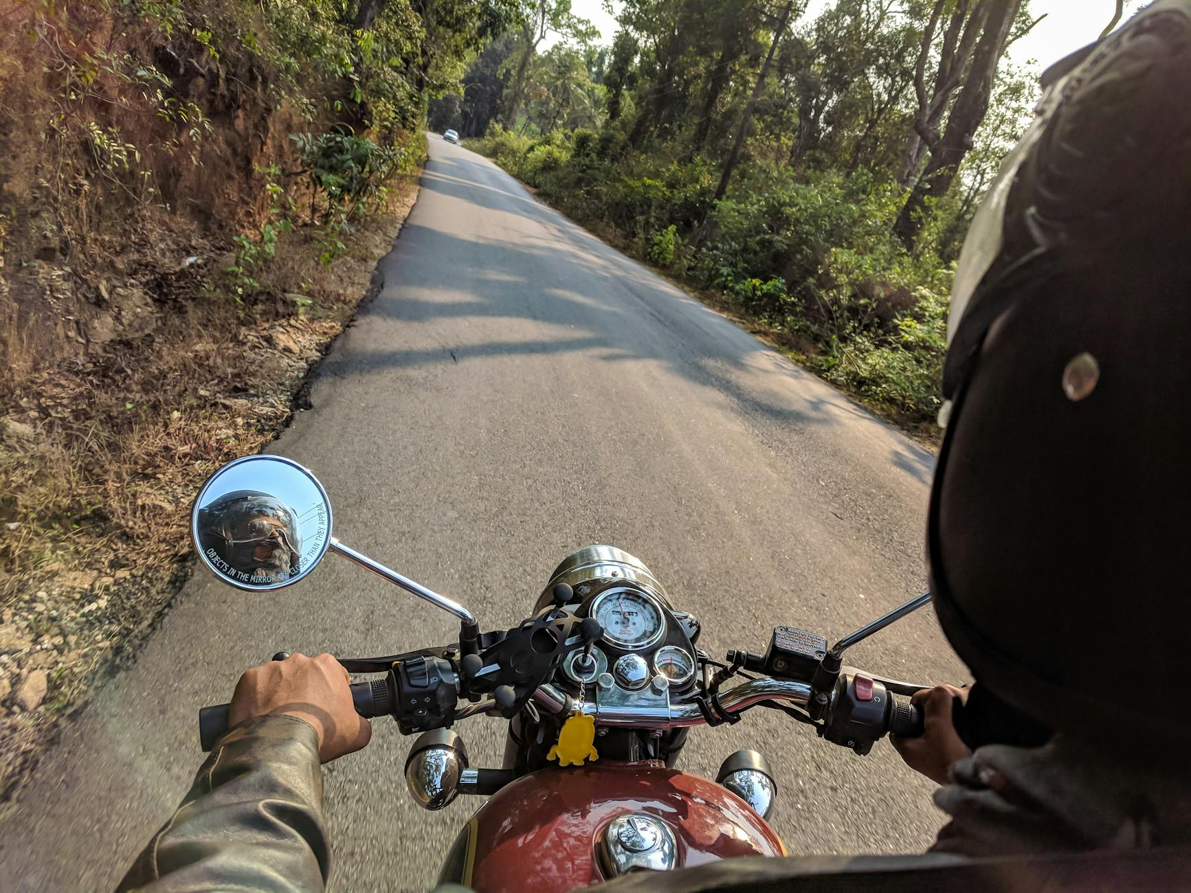
Michael, 32, is a mechanic living in Oakville, Ontario, Canada. He spends his free time taking his adventure bike on long trips or bombs around town on his sport bike in a riding group.
Track his activities and group rides. Wants to see where his group is in case they get separated; eliminating the need to pull over and share their location.
3 to 5 activities per week.
Group and solo activities.
Share activities with moto community.
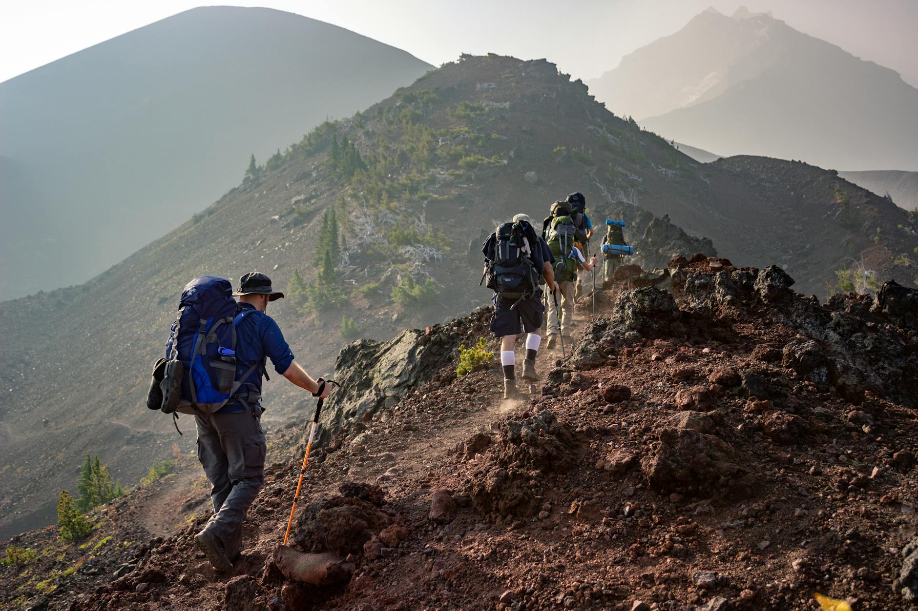
Sienna, 28, is a content creator living in her van while traveling British Columbia, Canada. She spends her time looking for the best views, frequently hiking and road-tripping.
Quickly switch between activities and while attaching photos to her posts to share with her friends and followers. She wants to engage more with the van-life community.
4 to 7 activities per week.
Hikes and long road trips.
Share activities with van-life community.
Relive aims to increase its user base by 25%. However, user interviews reveal a major barrier: 90% of potential users on competing platforms like Strava see no reason to switch, while only 2% are open to conversion. This signals a critical need to double down on what makes Relive unique—seamless recording and sharing of vehicular activities such as motorcycling and driving.
By enhancing the experience for vehicular users and introducing features tailored to their needs—battery-efficient navigation, ride-sharing maps, and dynamic friend tracking—we position Relive not just as an alternative to Strava but as the platform that prioritizes adventures on wheels. These users, once onboarded, may naturally extend Relive to cover all their fitness and outdoor activities, increasing retention and overall growth.
An analysis on the visual elements, information architecture, navigation, content, and anything that impacts the user's experience. Priority 0 is an important issue that needs to be tackled immediately while priority 3 is less important but still worth noting.
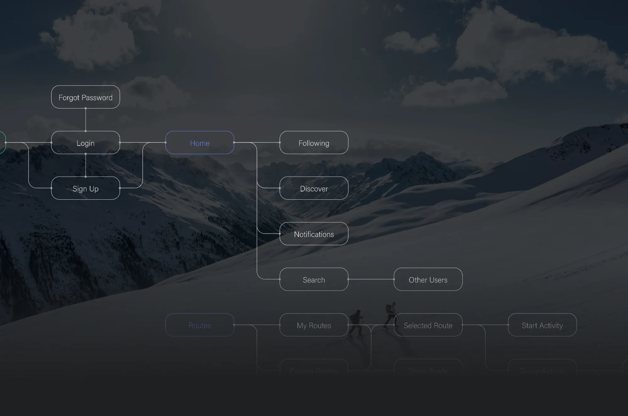
Alongside the priority log, while studying how users interact with the product, it's also important to log any new features we want to introduce that would benefit the users' experience. These can also be assigned a priority level. Alongside an improved UI design, we're going to tackle three new features.
A quicker activity selector will improve how users switch between activities - no more having to scroll through the entire list.
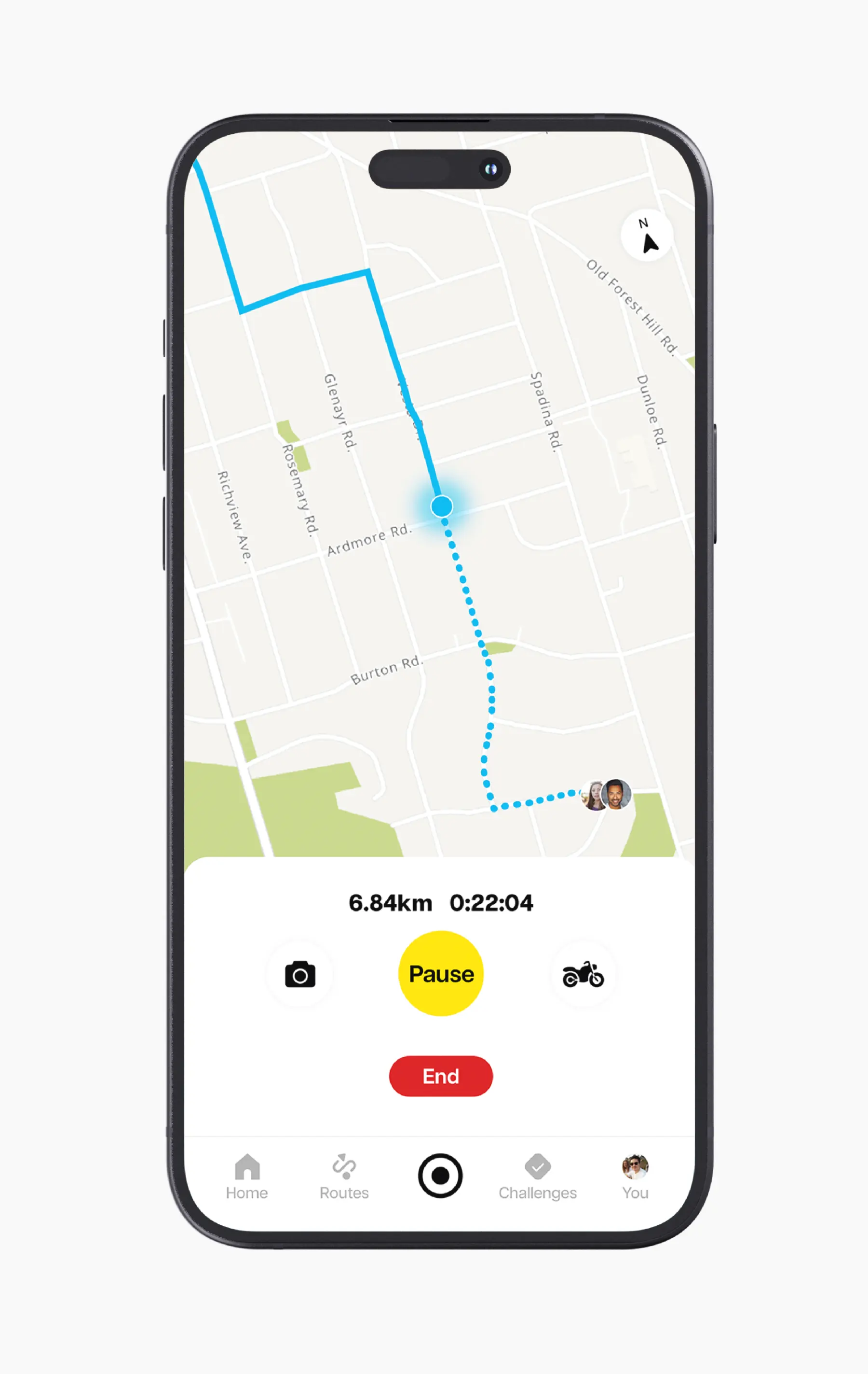
This will benefit users that perform group activities. If a user get's lost or left behind, they can check where their friends are located.
Instead of tracking your activity and route separately in an app like Google Maps, you can do it all within Relive. This will prevent unnecessary battery depletion.
iPhone 14 + 15 Pro
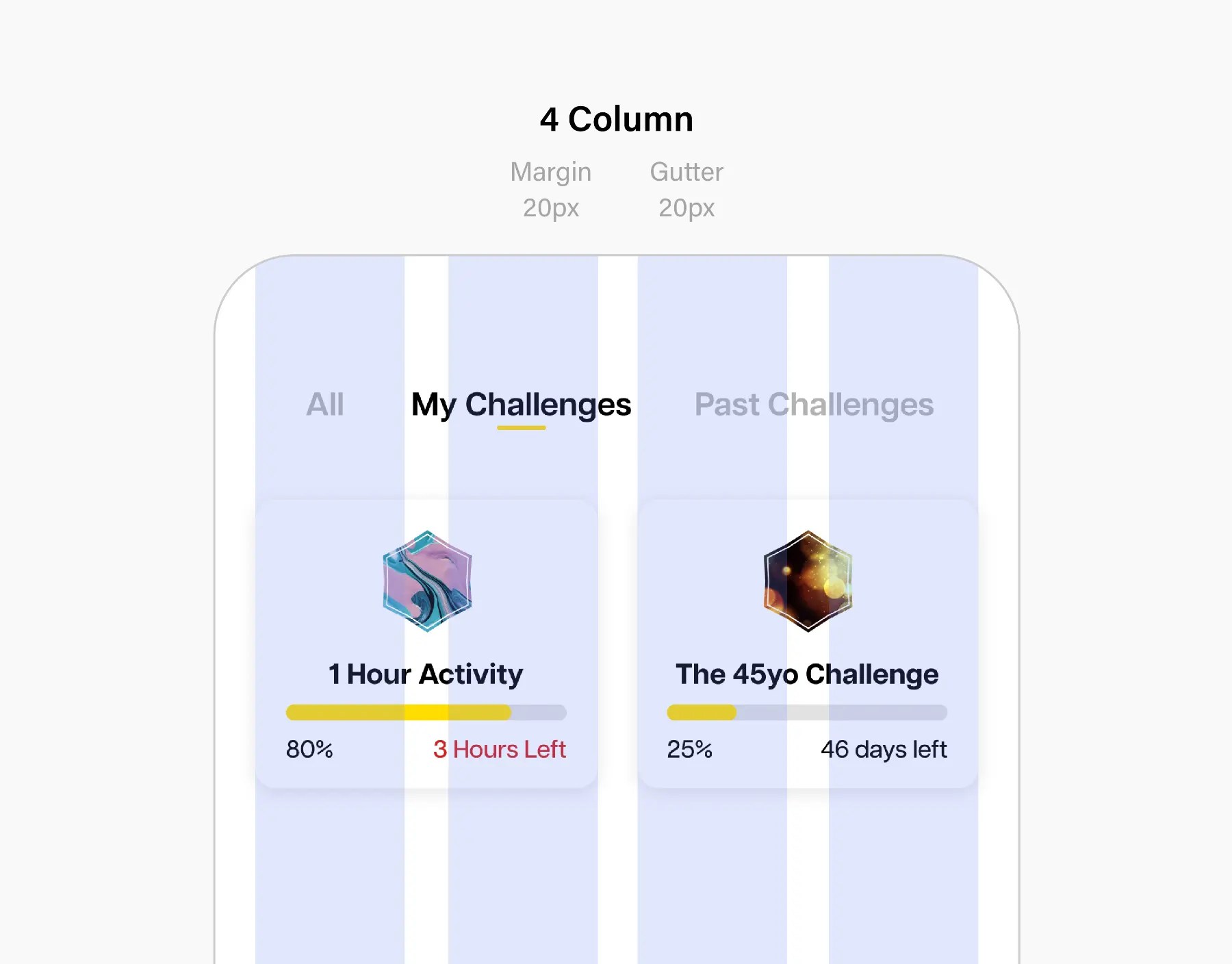
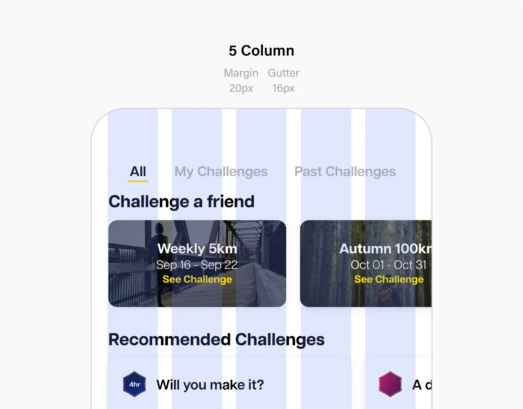
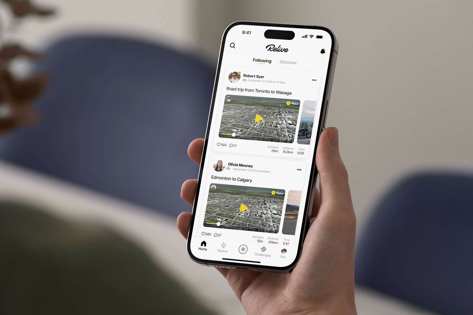
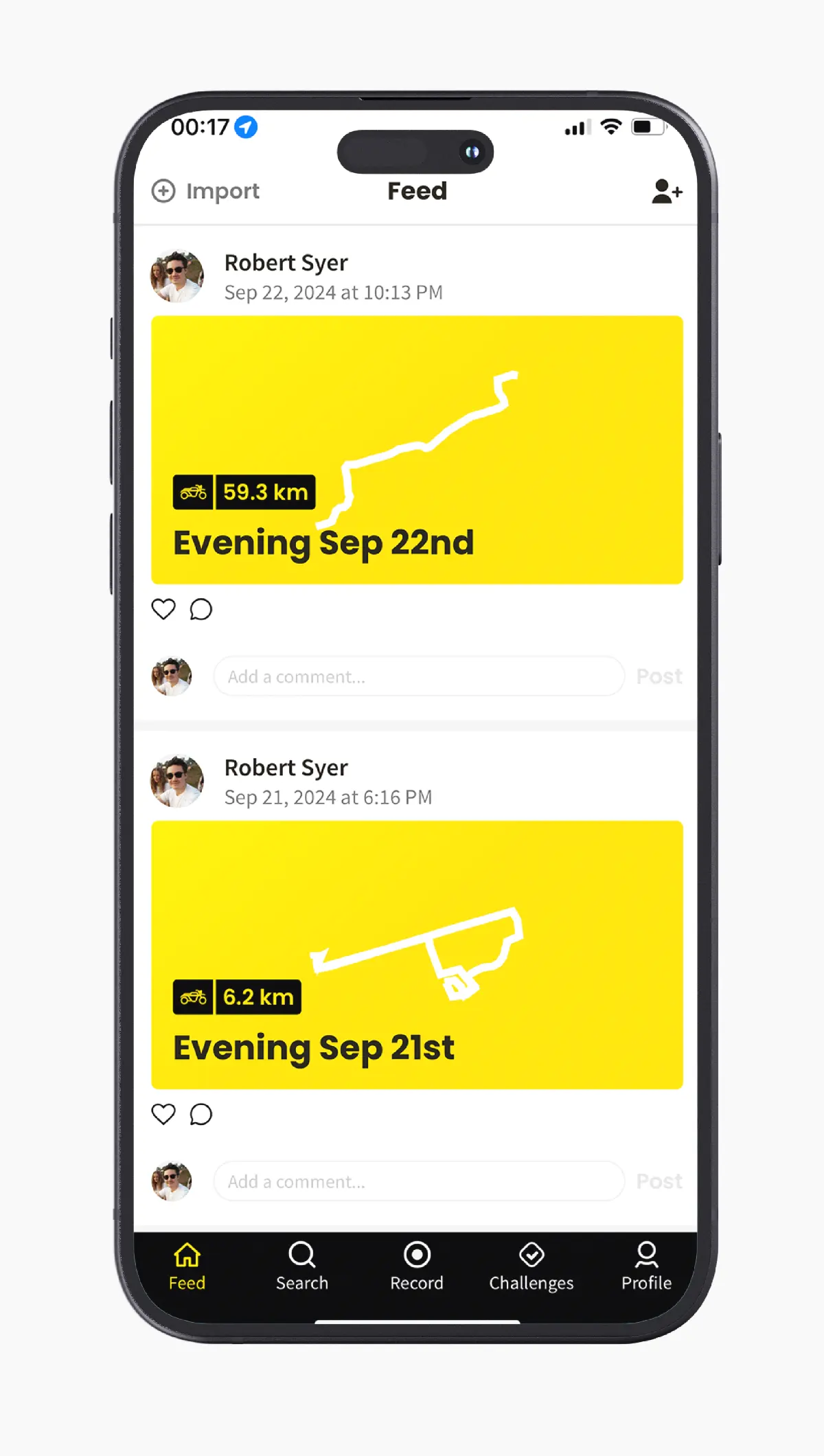
The new card system uses a drop shadow and radiused corners to soften the look. It maintains a minimalist feeling while ensuring the buttons and content stand out from the background.
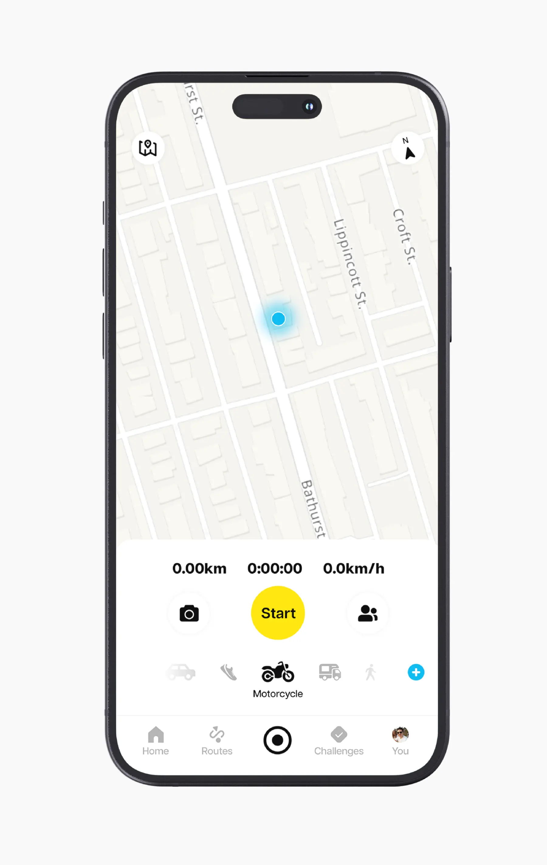
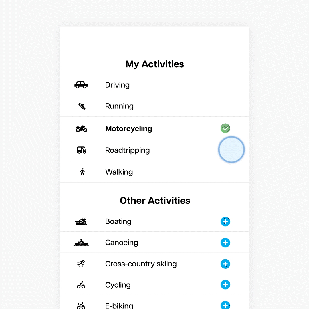
You no longer have to scroll through a list of 40+ activities. Click on the blue plus button to save the activity to your Activity Bar where you can quickly swipe between your common activities.
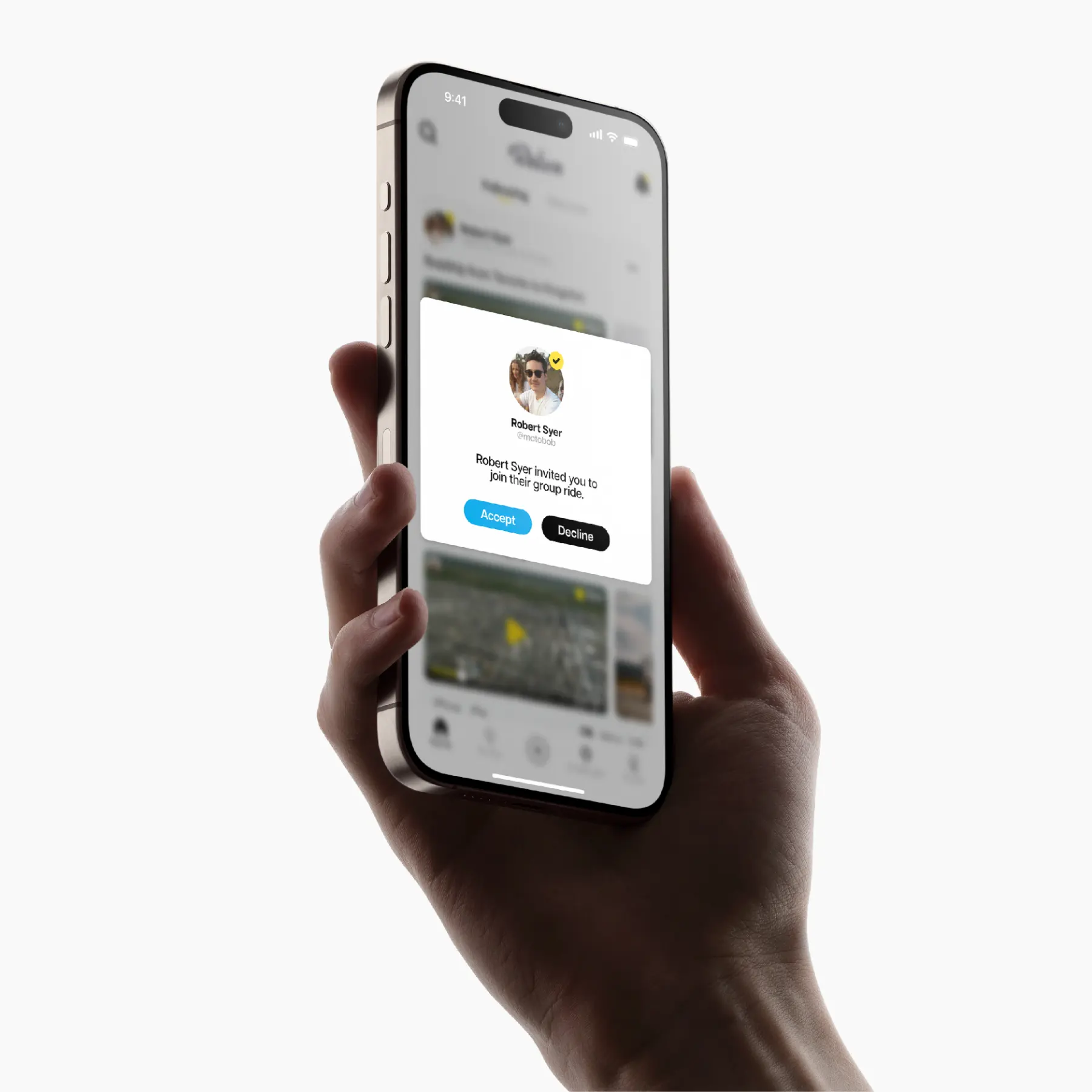
When performing a group activity, you can see where the others are in real time. This helps you follow their path in case you get separated.
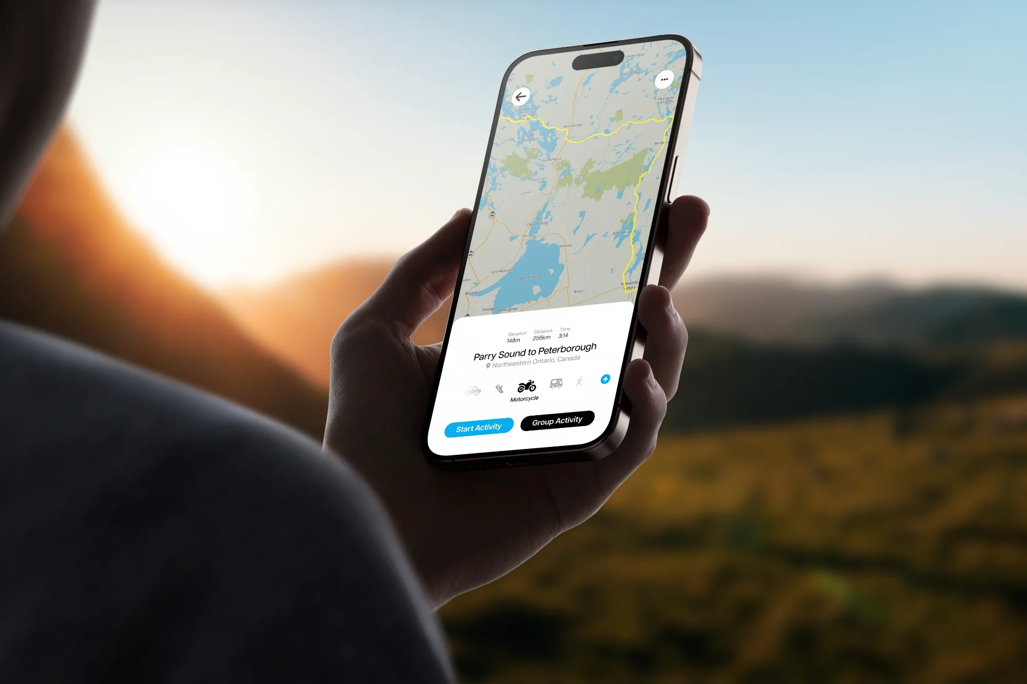
You can create custom routes by setting waypoints. Save, share, or explore custom routes based on your selected activity.
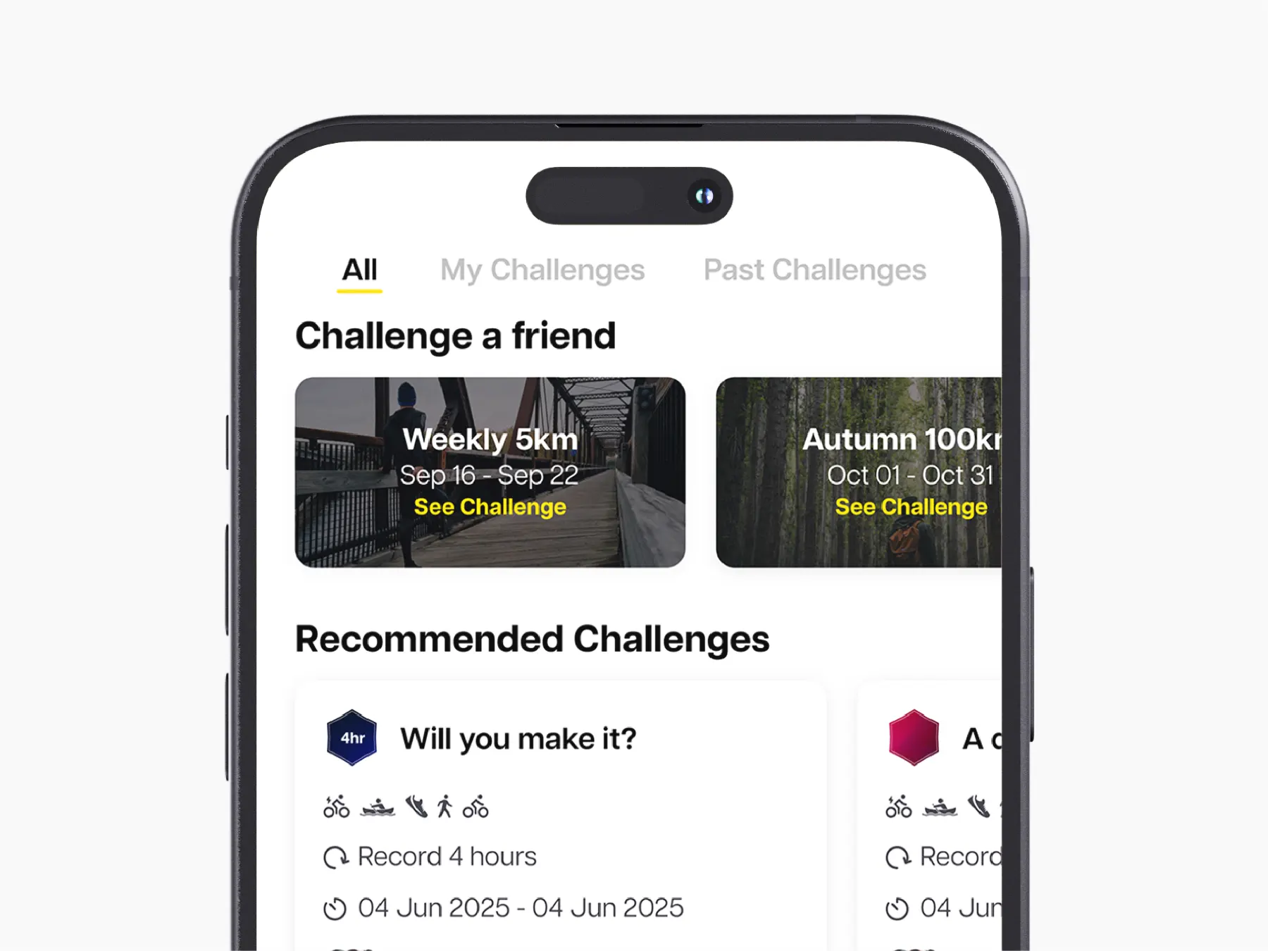
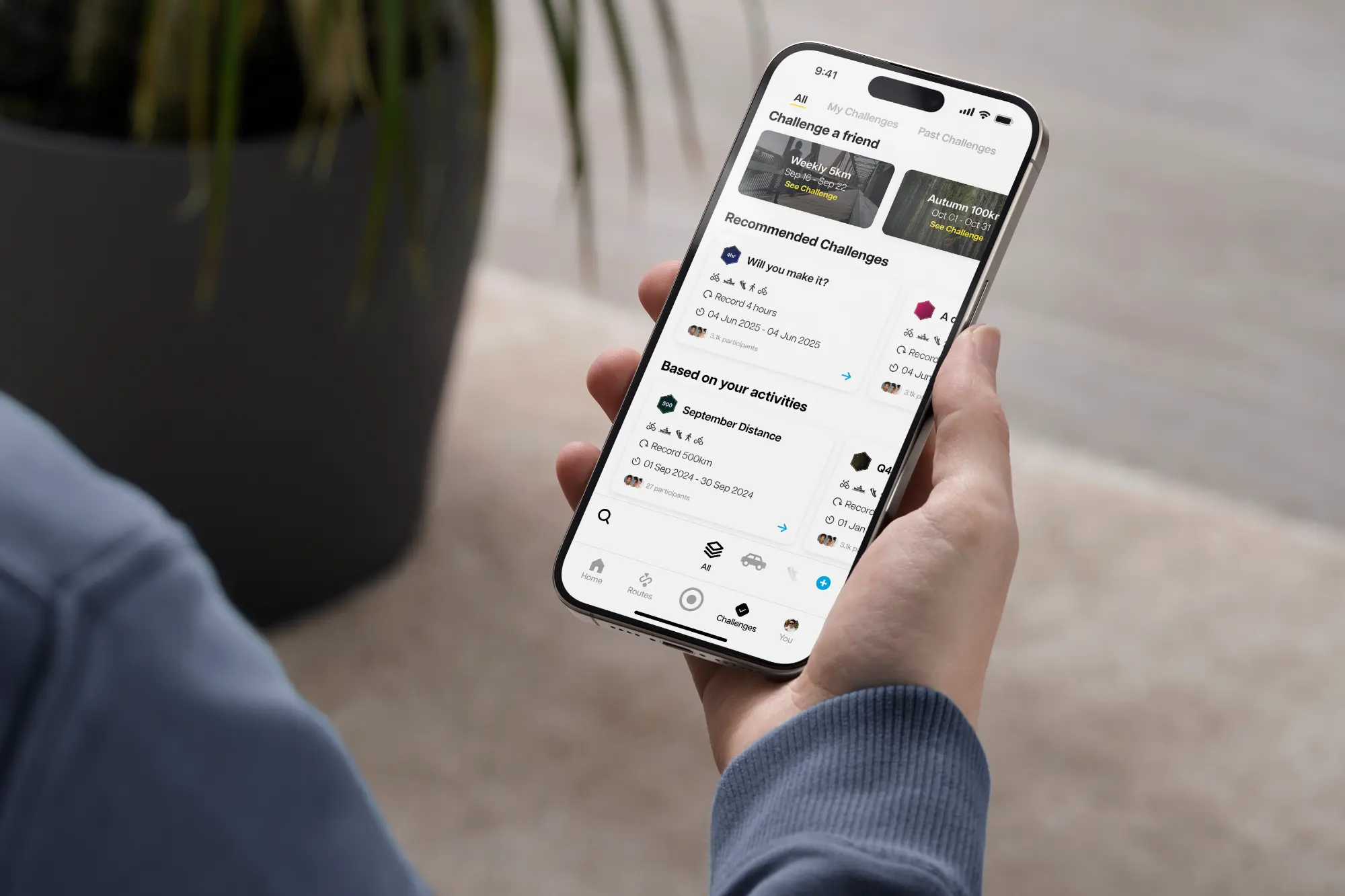
Navigate between all available challenges, your current challenges, or your challenge library.
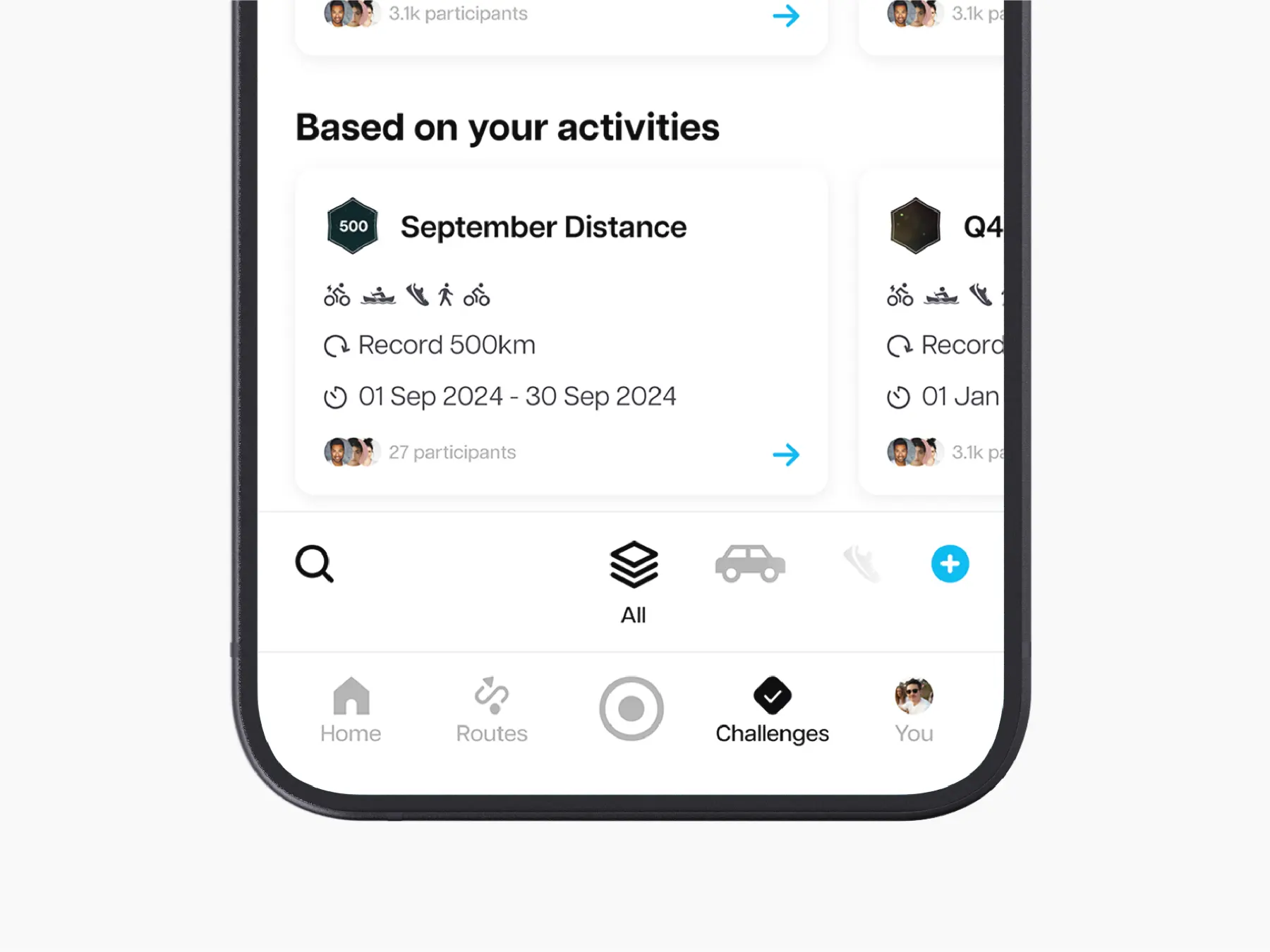
Filter your challenge results by using the quick activity selector.
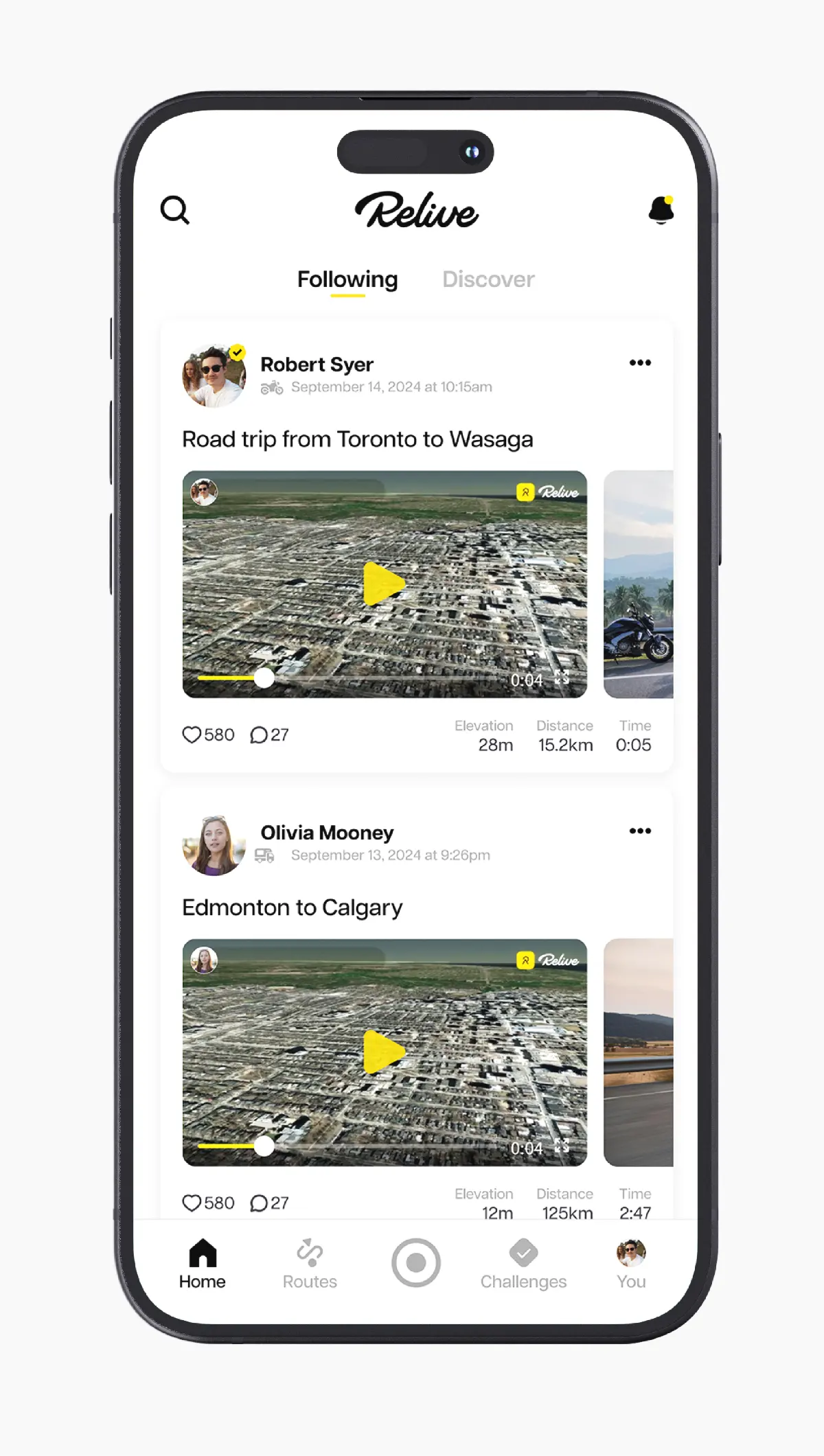
Before
After
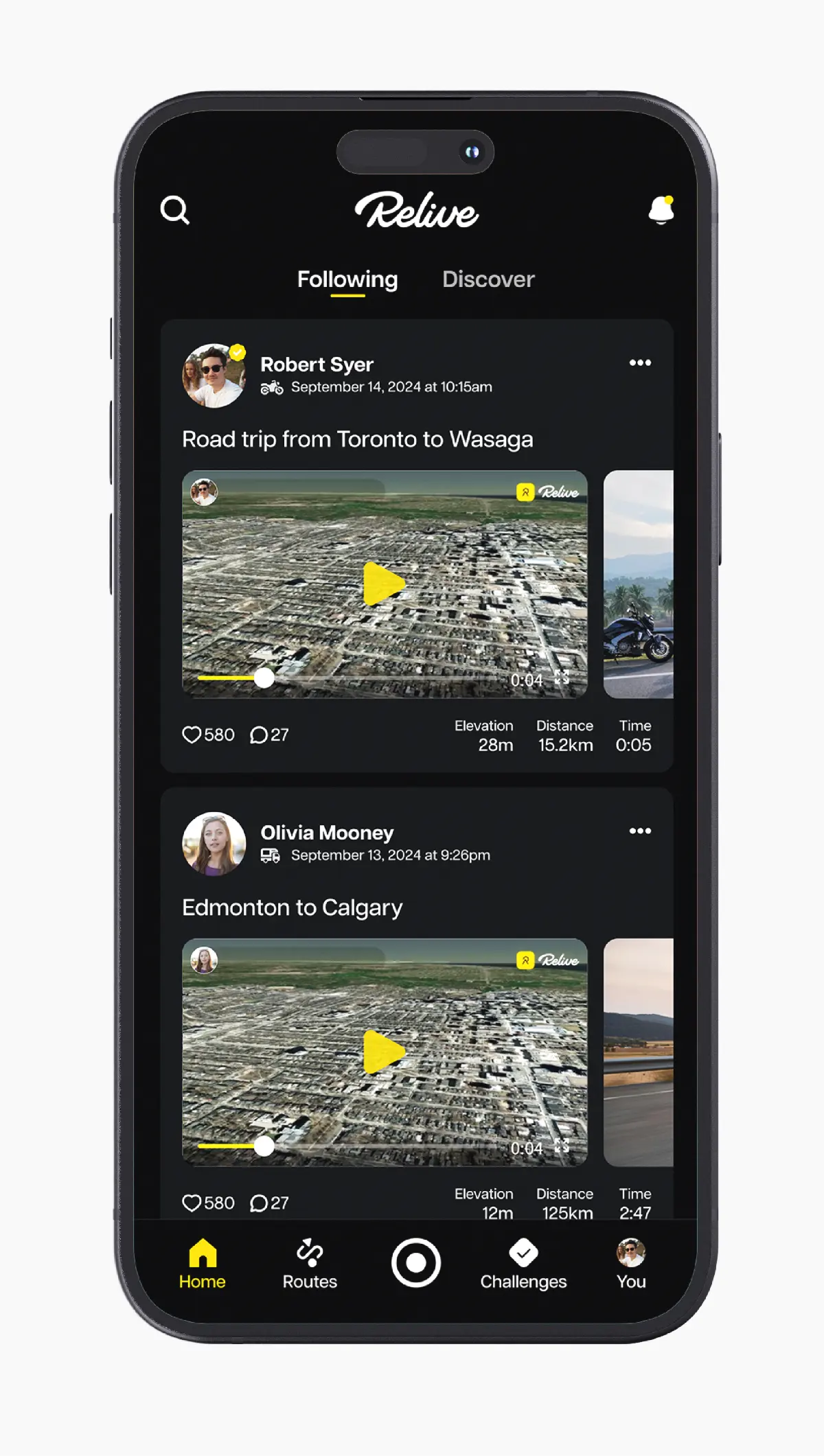
Dark Mode